A plain black-and-white QR code works, but it looks like nothing. So designers drop in a logo, switch the colours to match the brand, round the corners — and, often, quietly break the code. The worst part is that a broken branded code usually looks perfect; it just fails to scan for a chunk of people, and you only find out after it is printed. Here is exactly what breaks a branded code, a before-and-after, and five rules that let you brand it without sacrificing a single scan.
Why branding breaks codes
A QR code is not a picture — it is data drawn as squares. Every one of those modules is load-bearing, and three parts of the pattern do special jobs: the big nested squares in the corners (the finder patterns) tell a scanner where the code is and which way up it sits, and the blank margin around the edge (the quiet zone) lets the scanner separate the code from everything else. Branding goes wrong when it treats the code as decoration and paints over those load-bearing parts.
The saving grace is error correction: a QR code carries redundant data, so it can lose a share of its modules and still be rebuilt. That is what makes a centre logo possible at all. But error correction is a budget, not a blank cheque — spend it on an oversized logo and there is nothing left for the real-world wear the code will also face.
Five rules for a branded code that scans
1. Keep the logo to 25% and set error correction to H
The centre logo covers modules, and covered modules are lost data. Error correction level H can recover up to about 30% of a code, so keep the logo to no more than 25% of the code’s area — leaving headroom for smudges and bad light on top of the logo. Always pair a logo with level H; at lower levels the overlay alone destroys more than the code can rebuild. Our guide to error correction levels explains the budget in full.
2. Keep the contrast strong
Scanners read a QR code as dark modules on a light background. Pastel-on-white, dark-grey-on-black, or a trendy low-contrast palette makes the modules hard to tell apart — the single most common reason a styled code fails. Keep a genuinely dark foreground on a genuinely light background, and never invert the code (light modules on a dark background), which trips up a lot of scanners outright.
3. Protect the quiet zone
Designers love to tuck a code snugly into a corner or bleed it to the edge. Don’t. The code needs a clear margin — about four modules, roughly 10% of its width — with nothing in it. Crop the quiet zone and scanners can fail to lock onto the code at all, even when everything inside it is perfect.
4. Leave the finder patterns alone
The three corner squares are the code’s anchors. Recolouring them to your brand colour, rounding them into blobs, or dropping a logo near them is asking for intermittent failures — the kind that scan on your phone but not on a customer’s. Style the data modules if you like, but keep the finder patterns high-contrast and their shape intact.
5. Change one thing at a time
If you restyle everything at once and the code stops scanning, you have no idea which change did it. Add the logo, test. Change the colour, test. Round the corners, test. It is slower by a minute and saves you a reprint.
Colour and shape: what’s safe to brand
The rules above can read as “don’t touch anything,” but you actually have more room than you might think — as long as you spend it in the right places. Safe to style: recolouring the data modules to a brand colour, provided it stays genuinely dark against a light background; rounding the data modules or using a dot style for a softer look; and placing a modest, well-contained centre logo. These change the code’s personality without touching the parts a scanner depends on.
Risky, and best avoided: gradients that fade any part of the code toward the background, recolouring or reshaping the three finder patterns, and low-contrast “aesthetic” palettes. A reliable recipe that still looks branded: one dark brand colour for the modules, the finder patterns kept crisp and high-contrast, a solid light background, and a small centre logo on level H. That gives you a distinctly on-brand code with none of the failure modes.
Reading the before-and-after
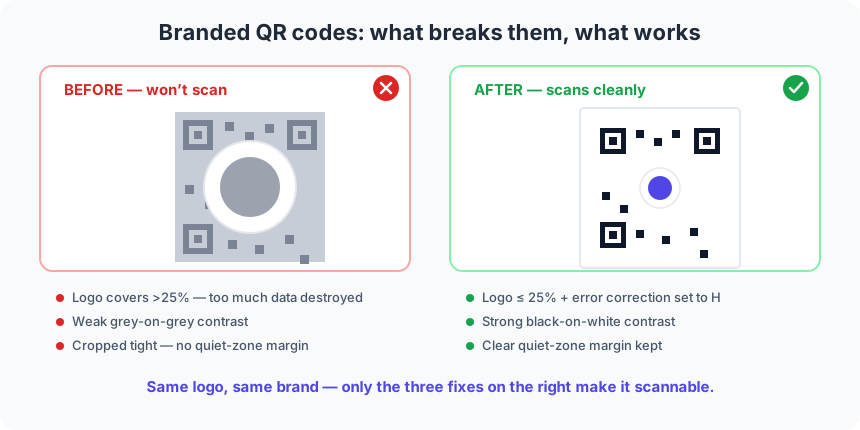
The two codes in the diagram carry the same brand and the same logo. The before version fails on all three counts at once: the logo is far too big and swallows the middle of the code, the grey-on-grey palette leaves almost no contrast, and it is cropped flush to the edge with no quiet zone. The after version keeps the identical logo but shrinks it under 25% on level H, restores a true black-on-white contrast, and gives the code a clean margin. Nothing about the brand changed — only the three technical fixes — and that is the difference between a code that scans every time and one that fails for the people you most wanted to reach.
Doing it in QRStudio
QRStudio is built to keep you on the right side of these rules. Upload a logo and it automatically raises error correction to H; the colour pickers keep foreground and background separate so you control contrast directly; and the Scannability check beneath the preview watches your settings live — it flags weak or inverted contrast, warns when a logo needs level H, and reminds you about the quiet zone — so you catch a broken code on screen instead of on the printer. Export as SVG for print and the whole thing stays razor-sharp at any size. See our step-by-step logo guide for the full walkthrough.
The test that settles it
No amount of on-screen checking replaces one real print. Print the final branded code at its true size, then scan it with two or three different phones — ideally one iPhone and one mid-range Android — from the distance people will really use. For extra confidence, cover a corner of the logo with your fingertip and confirm it still reads; that simulates the smudges and wear a printed code meets in the wild. If it survives that, your branding is safe to ship. If it stumbles, our troubleshooting guide will tell you which rule to revisit.