A QR code is a visual shortcut that assumes a lot: good eyesight, a steady hand, a charged smartphone, mobile data, and the confidence to use all of it. When any of those is missing, the code silently shuts someone out — and it's usually the same people, again and again. The good news is that making a QR code accessible costs almost nothing and takes minutes. Here's how to make sure yours works for everyone.
Who gets left out
It helps to picture the real people a bad QR code excludes. Someone with low vision can't resolve a small, low-contrast code. Someone with a motor or dexterity difference struggles to hold a phone steady and frame it. Many older people, and anyone on a tight budget, don't carry a smartphone or data at all. People with cognitive differences may not know what the pattern is for. And a code that leans on colour alone loses anyone who is colour-blind. None of these are edge cases — together they're a large share of any real audience.
Contrast and colour
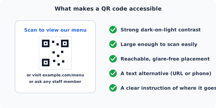
Scanners — and low-vision users — need a genuinely dark code on a genuinely light background. Trendy pastel-on-white or dark-grey-on-black palettes look designed but read poorly, and inverting the code (light modules on a dark background) fails on many devices outright. Never rely on colour alone to carry meaning, and keep contrast high; if it's hard for a scanner, it's harder for a human eye. Our guide to branded codes that still scan covers how to stay on-brand without sacrificing this.
Size and placement
A code that's technically scannable can still be practically unreachable. Make it comfortably large — err bigger than the minimum size so people don't have to lean in or crouch. Place it at a height a seated wheelchair user and a standing adult can both reach and frame, away from glare and reflections, and never behind glass that bounces light back at the camera. A code stuck too high, too low, or in a dark corner is an accessibility barrier even when the pattern is perfect.
Always give a text alternative
This is the single most important rule, so it gets its own section: a QR code should never be the only way to get the information. Print the destination as readable text next to the code — the URL, a phone number, or the actual information itself. “Scan for our menu, or visit example.com/menu, or ask any staff member” costs you one line and rescues everyone the code would otherwise strand. If the QR is the sole path to something people need — a menu, a form, a payment, safety information — you have built a wall, not a shortcut.
Clear, descriptive instructions
Don't assume everyone knows what the square of dots does or where it leads. A short, specific instruction — “Scan to view our menu”, not a bare code — tells people what will happen and lets them decide. Naming the destination also builds trust and, usefully, helps guard against the sticker-swap scams we cover in our QR security guide: if the sign says one place and the phone shows another, something is wrong.
Digital codes: add alt text, and keep the destination accessible
When a QR code appears on a screen — in an email, a web page, or a PDF — a screen-reader user can't see it at all. Give the image descriptive alt text that includes what it is and where it goes, and put the same link in plain text nearby so it can be read aloud and followed without a second device.
Finally, accessibility doesn't end at the scan. The page the code opens must itself be accessible: mobile-friendly, readable at a larger text size, navigable by screen reader, and quick to load. A perfectly inclusive code that lands on an unusable page has only moved the barrier one step down the line.
A quick accessibility checklist
- Strong dark-on-light contrast; never rely on colour alone.
- Comfortably large — bigger than the minimum scannable size.
- Reachable, glare-free placement for seated and standing people.
- A text alternative every time: URL, phone, or the information itself.
- A clear instruction naming what it does and where it goes.
- Alt text on any on-screen code, plus the link in plain text.
- A destination page that is fast, mobile-friendly, and screen-reader-friendly.
Run any code you make through that list and it will work for far more people than the average QR code in the wild — which is good for your audience, and good for you.
Why it's worth the few minutes
Beyond simply being the right thing to do, accessible codes are good practice on every front. Most of the fixes — higher contrast, a larger code, a clear instruction, a text alternative — make the code easier for everyone to scan, so your overall scan rate goes up, not just access for people with disabilities. In some contexts there are legal expectations around equal access to information and services, and a QR code that is the only route to something essential can fall foul of them.
And there's plain reputation: a business that strands a guest at the door of its own menu looks careless, while one that offers the code, the link, and a friendly “just ask us” looks thoughtful. None of it takes long — fold it into a quick pre-print check and accessibility stops being a special project and becomes just how you make codes.